

Design Patterns for Effective User Interface Tables
Key Takeaways
- Responsive table layouts guarantee accessibility on all devices.
- Interactive features such as sorting and filtering streamline data exploration.
- Pagination is crucial for managing large datasets and maintaining clarity.
- Visual hierarchy aids comprehension and reduces cognitive load on users.
Table of Contents
- Responsive Design
- Sorting and Filtering
- Pagination
- Visual Hierarchy and Alignment
- Accessibility Considerations
- Conclusion
Tables are vital for organizing and presenting complex information clearly in user interfaces. By thoughtfully applying design patterns, designers can create table experiences that not only empower users to explore data efficiently but also elevate the overall usability of an application. To discover a variety of inspiring table UI examples, designers and developers can reference established solutions and patterns for superior results.
The effectiveness of a data table depends upon the right blend of visual design and robust interactive features. Whether users are viewing tables on desktops, tablets, or mobile devices, design patterns play a significant role in accessibility, responsiveness, and user satisfaction. By focusing on base principles like responsive layouts and accessible navigation, teams can build tables that work for everyone, everywhere.
Modern applications often involve rapidly changing and voluminous data. Without thoughtful interface design, tables can quickly become confusing or unusable. Prioritizing practices such as sorting, filtering, and clear visual hierarchies ensures that both novice and advanced users can get the most value from tabular views.
Responsive Design
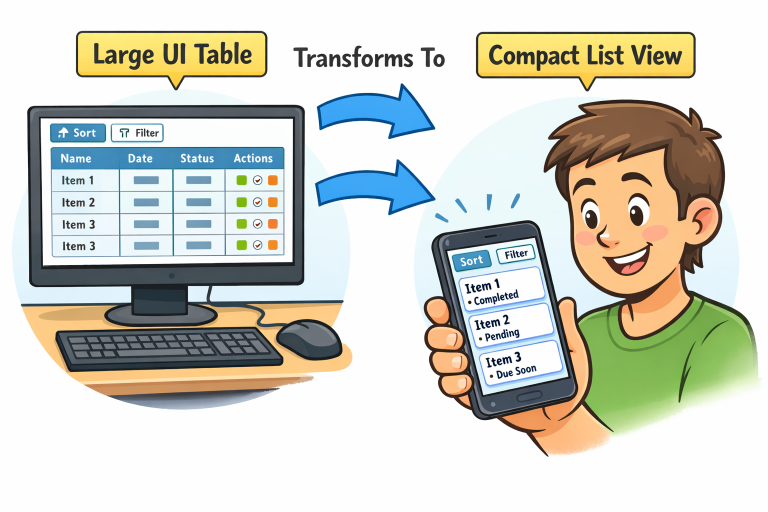
Responsive design is paramount when creating web tables, as users today interact with content across a wide range of devices. A well-designed responsive table ensures that data remains readable and navigable on anything from large monitors to mobile phones. Common techniques include wrapping tables in containers with horizontal scrolling and hiding non-essential columns on smaller screens. Using CSS rules like overflow-x: auto and relative font sizing helps in maintaining functionality and appearance, ensuring users do not have to constantly zoom or scroll awkwardly.
For advanced scenarios, transforming table layouts into card-based structures or list views on mobile can be effective. This tactic maintains data integrity and usability, even when space is constrained. Responsive design, as advocated in resources from the Nielsen Norman Group, ensures content flexibility and supports essential user needs, regardless of the browsing environment.
Sorting and Filtering
Sorting and filtering functionalities transform static tables into dynamic, user-controlled tools. Allowing users to click on column headers to sort data alphabetically or numerically makes it easier to find relevant information quickly. Interactive filtering options further enhance the navigation and utility of tables, letting users narrow down results based on criteria such as date ranges, categories, or text search.
Usability studies highlight that well-placed and intuitive controls are crucial for these features. Sort indicators, such as arrow icons, guide users visually while providing clear feedback on current sort states. Filter elements, such as dropdowns or search boxes, should be positioned above or within table headers for instant access. These interactive elements must be built with accessibility in mind, using semantic buttons and ARIA (Accessible Rich Internet Applications) attributes for assistive technology compatibility.
Pagination
Large datasets can overwhelm users and degrade performance if displayed all at once. Pagination helps prevent this by splitting content into digestible pages, each containing a manageable number of rows. This approach optimizes load times, reduces cognitive load, and allows users to focus on relevant data.
Navigation controls, such as next and previous arrows or direct page links, should be clearly labeled and easy to use. Options to adjust the number of rows per page or jump to the first and last pages further improve usability. Always provide feedback, such as indicating the current page, to help users maintain context. Pagination ensures scalability and is a must-have for enterprise-grade data tables or any application dealing with voluminous records.
Visual Hierarchy and Alignment
Visual hierarchy determines how easily a user can scan, interpret, and understand data in a table. Establishing clear relationships between headers, rows, and columns reduces mental fatigue. Use distinct header styles, such as bold text or background shading, to differentiate labels from data cells. Align text according to content type, for example, right-aligning numbers and left-aligning text entries.
read more : https://bistrovista.com/
Grouping and Spacing
Consistent spacing between rows and groupings within columns can further differentiate related data and aid quick comparisons. Alternating background colors or subtle dividing lines contribute to scannability. The use of whitespace, typography, and color cues is a fundamental principle covered in detail by leading UX publications and is essential for well-organized data presentation.
Accessibility Considerations
Accessibility is a core requirement for user-centric table design. Utilizing semantic HTML, such as <table>, <thead>, <tbody>, and <th> elements, ensuring that assistive technologies can interpret the data structure. Tables should include keyboard navigability so users who cannot use a mouse can move between cells and action controls efficiently.
Every image or icon in tables must have descriptive alt text, and all interactive components should have accessible labels. High contrast ratios and adequate font sizes further improve readability for users with visual impairments. Adhering to standards like WCAG (Web Content Accessibility Guidelines) is essential for legal compliance and inclusive design. More accessibility tips can be found from trusted sources such as W3C Web Accessibility Initiative.
Conclusion
Design patterns for user interface tables are central to building effective, user-friendly digital products. By implementing best practices in responsiveness, interactivity, visual hierarchy, and accessibility, designers can ensure their tables present data clearly and inclusively. These patterns help serve a broad range of users and contexts, making tabular data easy to explore, understand, and use in everyday workflows.